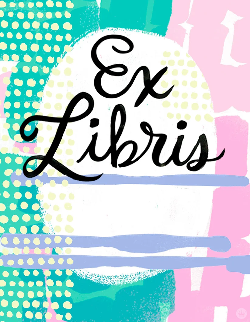
In celebration of #NationalBookLoversDay I created a post for Think.Make.Share. featuring downloadable bookplates by several Hallmark artists (including myself!). Go peruse and download some for your own library HERE. Happy reading!

Letters are lovely recap
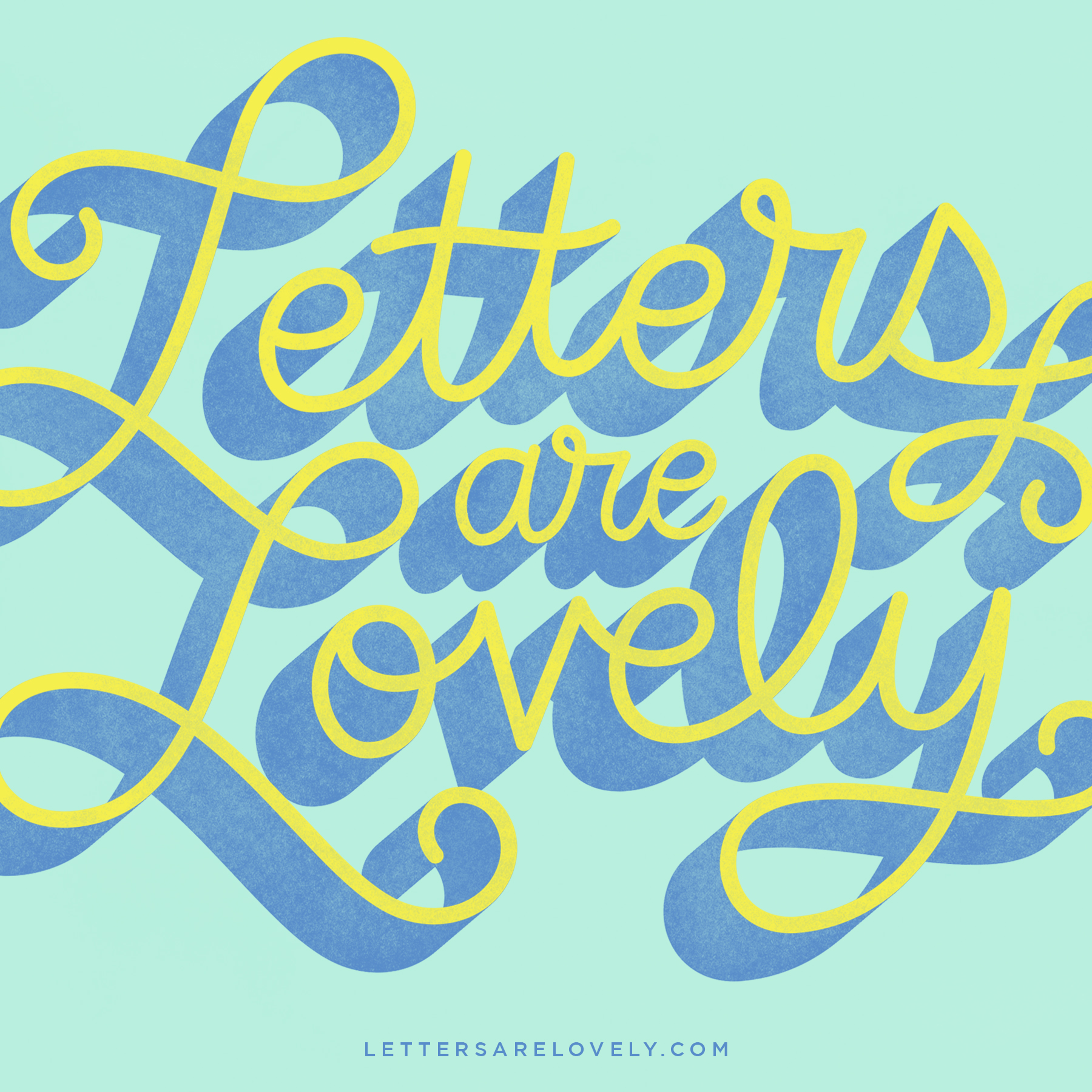
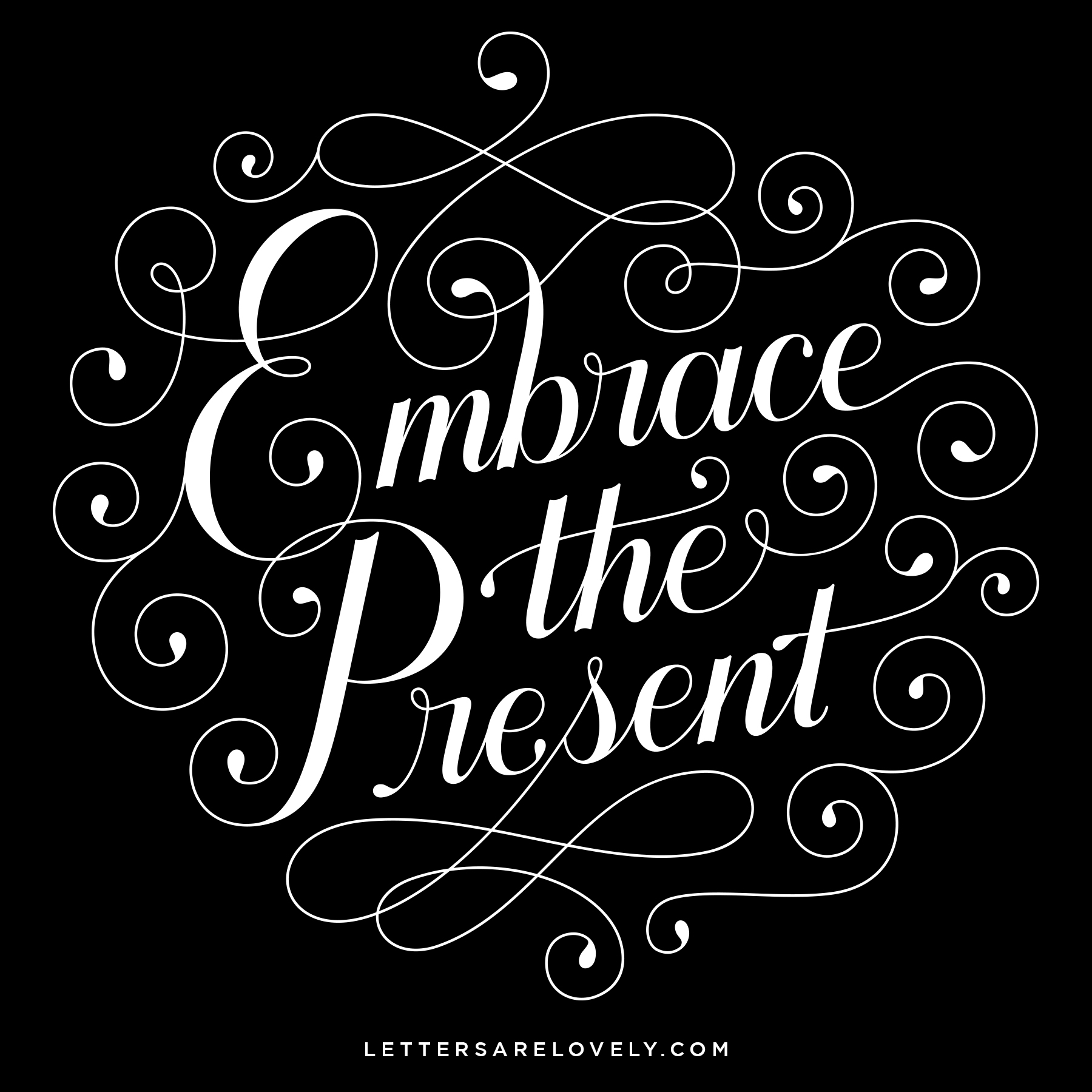
Here is a recap of the first nine of my Letters Are Lovely pieces! I will be posting another recap in the future so it will be interesting to compare the two. Any favorites?

Commercial Type Talk: STLDW
Paul Barnes, of Commercial Type, began his St. Louis Design Week talk with a quote:
It's not just about the money, it's not just about the art. It was fascinating to hear his perspective on running Commercial Type, and how he works with Christian Schwartz in their offices in New York and London. A longtime Vanity Fair reader, I loved learning about the process of developing typefaces for their brand, and this was just one example from their impressive list of clients. The historical influences in Commercial Type's work are undeniable, but what is rooted in the classical becomes expressive and modern in personal work like Dala Prisma. I love how their employees get one day a week to step away from client work and explore. I found the entire talk inspiring, thanks STLDW for bringing in such an interesting speaker!


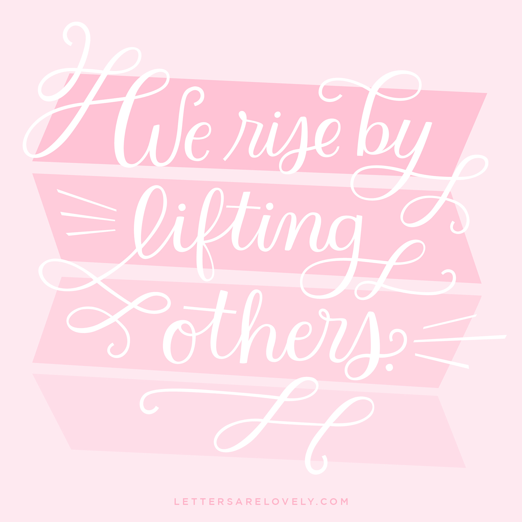
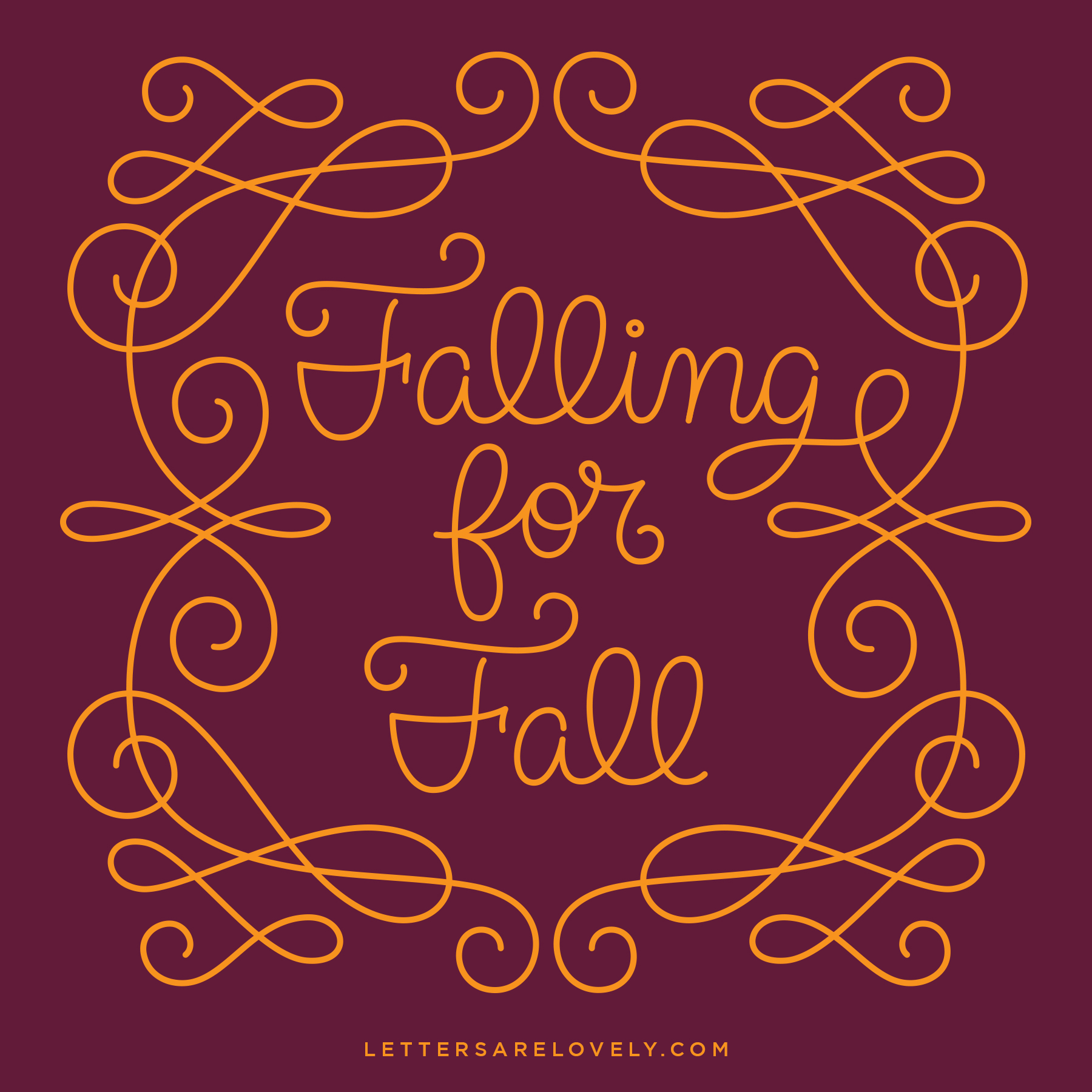
Letters Are Lovely 3
Playing with some brush lettering this week. Enjoy!

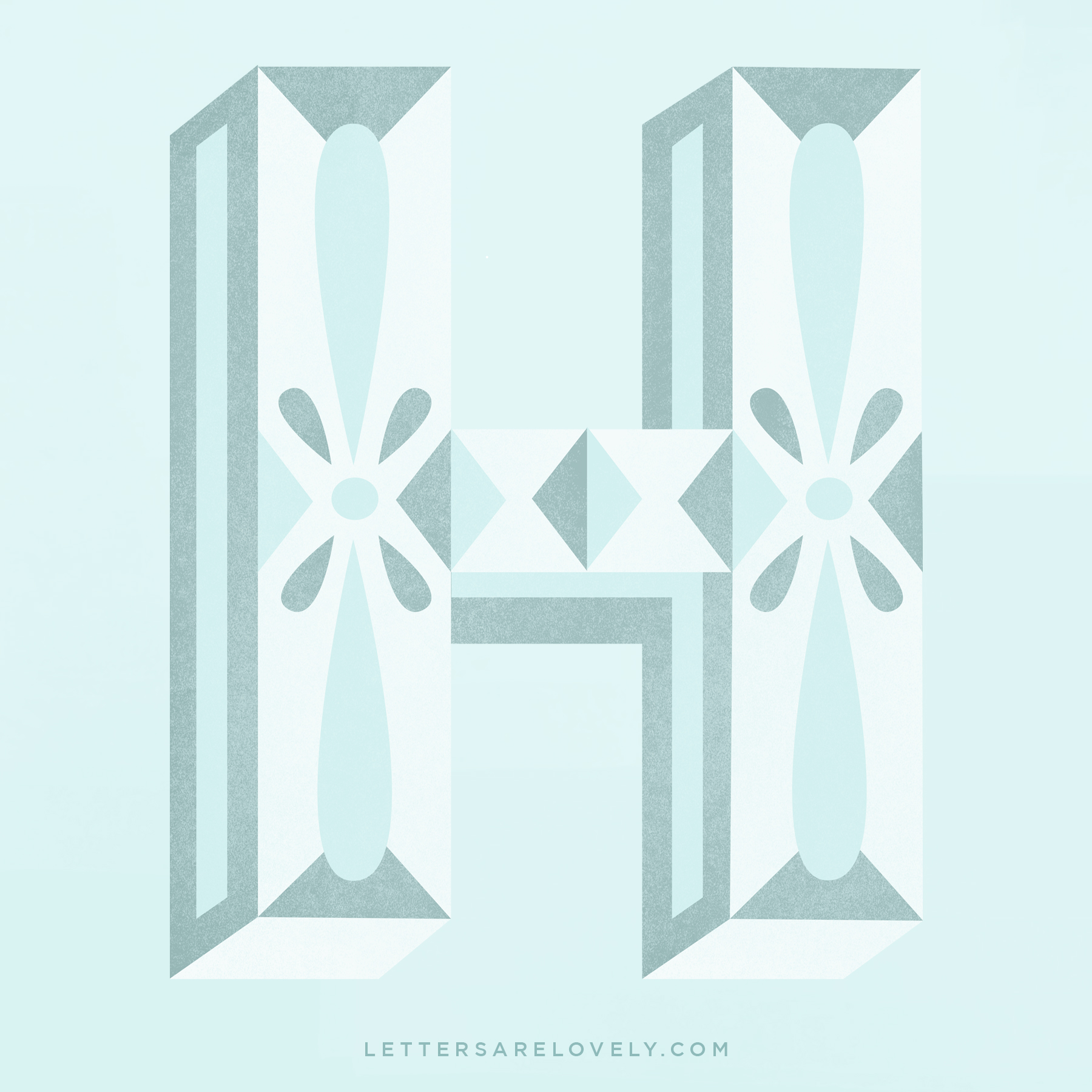
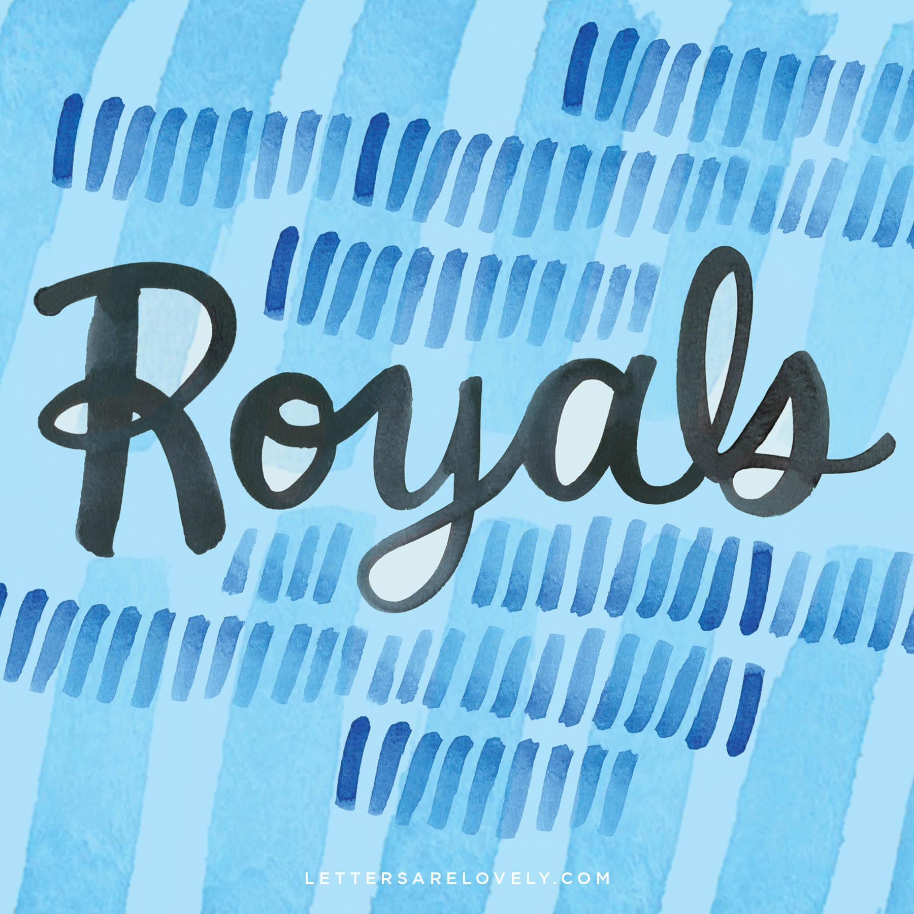
Letters Are Lovely 2
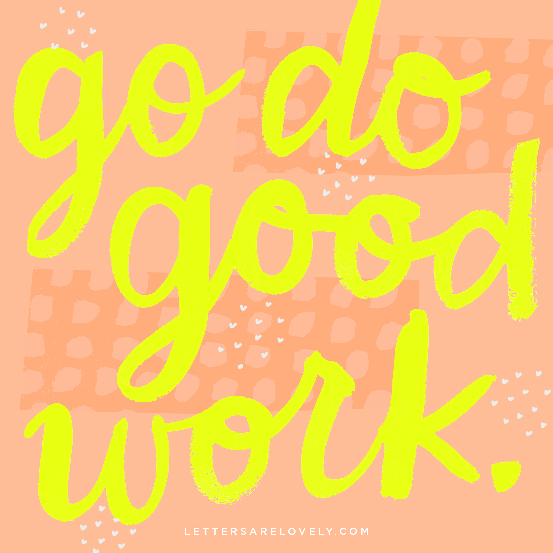
Current motto.

Insta Inspiration
I love being inspirited by artists I follow on Instagram. Here are six lettering artists who inspire me daily!
In order of appearance:
Becca Clayson (@beccaclason)
Patrick Cabral (@darkgravity)
Scott Biersack (@youbringfire)
Lynn Giunta (@lynn_giunta)
Alan Guzman (@zhompi)
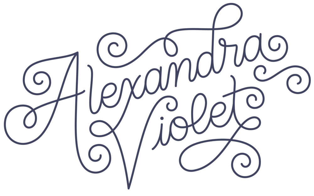
Alexandra Nelson (@alimakesthings).
